 Blog
Blog CSS
CSS HTML
HTML JQuery
 JScript
 Website


I’ve had a few requests from readers asking how to install a dropdown menu without j-query due to heavy load. So here it is, a multi level dropdown/flyout menu. The original code is from CSSPlay. I modified the CSS part a little to adapt to Blogger template. This four level dropdown/flyout menu should work in most browsers. A tab with small caps indicates it has upper level/levels. A dropdown/flyout will appear when you hover the tab.
Installing The Menu:
Go to "Edit HTML".
Find </head> Tag And Copy-Past The Below Code Just After It.
<!-- Dropdown HTML Menu Start -->
<div id="menu">
<ul class="level1">
<li class="level1-li"><a class="level1-a" href="#url">Home</a></li>
<li class="level1-li"><a class="level1-a fly" href="#url">Contact Us<!--[if gte IE 7]><!--></a><!--<![endif]-->
<!--[if lte IE 6]><table><tr><td><![endif]-->
<ul class="level2">
<li><a href="#url">Email</a></li>
<li><a href="#url">Telephone</a></li>
<li><a href="#url">Online Form</a></li>
<li><a href="#url">Snail Mail Address</a></li>
</ul>
<!--[if lte IE 6]></td></tr></table></a><![endif]--></li>
<li class="level1-li"><a class="level1-a fly" href="#url">Resort<!--[if gte IE 7]><!--></a><!--<![endif]-->
<!--[if lte IE 6]><table><tr><td><![endif]-->
<ul class="level2">
<li><a href="#url">Ski Hire Facilities</a></li>
<li><a class="fly" href="#url">Main Ski Slopes<!--[if gte IE 7]><!--></a><!--<![endif]-->
<!--[if lte IE 6]><table><tr><td><![endif]-->
<ul class="level3">
<li><a href="#url">Beginners Slopes</a></li>
<li><a href="#url">Intermediate Slopes</a></li>
<li><a class="fly" href="#url">Advanced Skill Levels<!--[if gte IE 7]><!--></a><!--<![endif]-->
<!--[if lte IE 6]><table><tr><td><![endif]-->
<ul class="level4">
<li><a href="#url">Local</a></li>
<li><a href="#url">Nearby</a></li>
<li><a href="#url">With instructor</a></li>
<li><a href="#url">Snow boarding</a></li>
</ul>
<!--[if lte IE 6]></td></tr></table></a><![endif]--></li>
<li><a href="#url">Expert</a></li>
</ul>
<!--[if lte IE 6]></td></tr></table></a><![endif]--></li>
<li><a href="#url">Night Life</a></li>
<li><a class="fly" href="#url">Restaurants<!--[if gte IE 7]><!--></a><!--<![endif]-->
<!--[if lte IE 6]><table><tr><td><![endif]-->
<ul class="level3">
<li><a href="#url">Snow Hotel</a></li>
<li><a href="#url">The Snowman</a></li>
<li><a href="#url">Ice Cavern</a></li>
<li><a href="#url">Ski Inn</a></li>
</ul>
<!--[if lte IE 6]></td></tr></table></a><![endif]--></li>
<li><a class="fly" href="#url">Car Hire<!--[if gte IE 7]><!--></a><!--<![endif]-->
<!--[if lte IE 6]><table><tr><td><![endif]-->
<ul class="level3">
<li><a href="#url">From Airport</a></li>
<li><a href="#url">In Resort</a></li>
<li><a href="#url">Multiple Resorts</a></li>
</ul>
<!--[if lte IE 6]></td></tr></table></a><![endif]--></li>
</ul>
<!--[if lte IE 6]></td></tr></table></a><![endif]--></li>
<li class="level1-li"><a class="level1-a fly" href="#url">Surrounding Area<!--[if gte IE 7]><!--></a><!--<![endif]-->
<!--[if lte IE 6]><table><tr><td><![endif]-->
<ul class="level2">
<li><a href="#url">Where to go</a></li>
<li><a href="#url">What to do</a></li>
<li><a href="#url">Places of interest</a></li>
<li><a href="#url">National parks & Museums</a></li>
</ul>
<!--[if lte IE 6]></td></tr></table></a><![endif]--></li>
<li class="level1-li"><a class="level1-a" href="#url">Privacy</a></li>
<li class="level1-li"><a class="level1-a" href="#url">About Us</a></li>
<li class="level1-li"><a class="level1-a" href="#url">Contact Us</a></li>
<li class="level1-li"><a class="level1-a" href="#url">SiteMap</a></li>
<li class="level1-li"><a class="level1-a" href="#url">Official Website</a></li>
<li class="level1-li left"><a class="level1-a fly" href="#url">Information<!--[if gte IE 7]><!--></a><!--<![endif]-->
<!--[if lte IE 6]><table><tr><td><![endif]-->
<ul class="level2">
<li><a href="#url">Money Exchange</a></li>
<li><a class="fly" href="#url">Resort Essential Information<!--[if gte IE 7]><!--></a><!--<![endif]-->
<!--[if lte IE 6]><table><tr><td><![endif]-->
<ul class="level3">
<li><a href="#url">Lift Passes</a></li>
<li><a href="#url">Insurance</a></li>
<li><a class="fly" href="#url">Gear Rental<!--[if gte IE 7]><!--></a><!--<![endif]-->
<!--[if lte IE 6]><table><tr><td><![endif]-->
<ul class="level4">
<li><a href="#url">Boots</a></li>
<li><a href="#url">Skis</a></li>
<li><a href="#url">Ski Wear</a></li>
<li><a href="#url">Goggles</a></li>
</ul>
<!--[if lte IE 6]></td></tr></table></a><![endif]--></li>
<li><a href="#url">Ski Schools</a></li>
<li><a href="#url">Snow Report</a></li>
</ul>
<!--[if lte IE 6]></td></tr></table></a><![endif]--></li>
<li><a class="fly" href="#url">Language<!--[if gte IE 7]><!--></a><!--<![endif]-->
<!--[if lte IE 6]><table><tr><td><![endif]-->
<ul class="level3">
<li><a href="#url">Austrian</a></li>
<li><a href="#url">German</a></li>
<li><a href="#url">French</a></li>
<li><a href="#url">English</a></li>
</ul>
<!--[if lte IE 6]></td></tr></table></a><![endif]--></li>
<li><a href="#url">Short Breaks</a></li>
</ul>
<!--[if lte IE 6]></td></tr></table></a><![endif]--></li>
</ul>
</div>
<!-- Dropdown HTML Menu End -->
#menu { background-color: #ba1eaa;
background-image: -moz-linear-gradient(#04acec, #ba1eaa);
background-image: -webkit-gradient(linear, left top, left bottom, from(#04acec), to(#ba1eaa));
background-image: -webkit-linear-gradient(#04acec, #ba1eaa);
background-image: -o-linear-gradient(#04acec, #ba1eaa);
background-image: -ms-linear-gradient(#04acec, #ba1eaa);
background-image: linear-gradient(#04acec, #0186ba);
height:35px;; text-align:center; position:fixed; z-index:20; right: 0%; left: 0%;}#menu ul {margin:0; padding:0; list-style:none; white-space:nowrap; text-align:left;}
#menu ul {display:inline-block;}
#menu li {margin:0; padding:0; list-style:none;}
#menu li {clear:both;float:none;}
#menu ul ul {position:absolute; left:-9999px;}
#menu ul.level1 {margin:0 auto;}
#menu ul.level1 li.level1-li {float:left; display:block; position:relative;clear:none;}
#menu ul.level1 {
background-color: #ba1eaa;
background-image: -moz-linear-gradient(#04acec, #ba1eaa);
background-image: -webkit-gradient(linear, left top, left bottom, from(#04acec), to(#ba1eaa));
background-image: -webkit-linear-gradient(#04acec, #ba1eaa);
background-image: -o-linear-gradient(#04acec, #ba1eaa);
background-image: -ms-linear-gradient(#04acec, #ba1eaa);
background-image: linear-gradient(#04acec, #0186ba)
}
#menu ul.level2 {
background-color: #ba1eaa;
background-image: -moz-linear-gradient(#04acec, #ba1eaa);
background-image: -webkit-gradient(linear, left top, left bottom, from(#04acec), to(#ba1eaa));
background-image: -webkit-linear-gradient(#04acec, #ba1eaa);
background-image: -o-linear-gradient(#04acec, #ba1eaa);
background-image: -ms-linear-gradient(#04acec, #ba1eaa);
background-image: linear-gradient(#04acec, #0186ba)
height:35px; width:250px;}
#menu ul.level3 {
background-color: #ba1eaa;
background-image: -moz-linear-gradient(#04acec, #ba1eaa);
background-image: -webkit-gradient(linear, left top, left bottom, from(#04acec), to(#ba1eaa));
background-image: -webkit-linear-gradient(#04acec, #ba1eaa);
background-image: -o-linear-gradient(#04acec, #ba1eaa);
background-image: -ms-linear-gradient(#04acec, #ba1eaa);
background-image: linear-gradient(#04acec, #0186ba)
height:35px; width:250px;}
#menu ul.level4 {
background-color: #ba1eaa;
background-image: -moz-linear-gradient(#04acec, #ba1eaa);
background-image: -webkit-gradient(linear, left top, left bottom, from(#04acec), to(#ba1eaa));
background-image: -webkit-linear-gradient(#04acec, #ba1eaa);
background-image: -o-linear-gradient(#04acec, #ba1eaa);
background-image: -ms-linear-gradient(#04acec, #ba1eaa);
background-image: linear-gradient(#04acec, #0186ba)
height:35px; width:250px;}
#menu b {position:absolute;} /* -- for IE6 non-flyout dropdowns to stop flickering - who knows why --*/
#menu a {display:block; font:normal 14px Arial; color:#fff; line-height:35px; text-decoration:none;padding:0px 15px 0 15px;outline:none;}
#menu ul.level1 li.level1-li a.level1-a {float:left;}
#menu ul li:hover > ul {visibility:visible; left:0; top:35px;}
#menu ul ul li:hover > ul {visibility:visible; left:100%; top:auto; margin-top:-35px;}
#menu li.left:hover > ul {visibility:visible; left:auto; right:0; top:25px;}
#menu li.left ul li:hover > ul {visibility:visible; left:auto; right:100%; top:auto; margin-top:-25px;}
#menu a:hover ul {left:0; top:30px;}
#menu li.left a:hover ul {left:auto; right:-1px; top:30px;}
#menu li.left ul a {text-align:right; padding:0 15px 0 15px;}
#menu a:hover a:hover ul,
#menu a:hover a:hover a:hover ul {left:100%; visibility:visible;}
#menu li.left a:hover a:hover ul,
#menu li.left a:hover a:hover a:hover ul {left:auto; right:0; visibility:visible;}
#menu a:hover ul ul,
#menu a:hover a:hover ul ul {left:-9999px;}
#menu li.left a:hover ul ul,
#menu li.left a:hover a:hover ul ul {left:-9999px;}
#menu li a.fly {font-variant: small-caps;}
#menu li.left ul a.fly {font-variant: small-caps;}
#menu li a:hover,
#menu li a.fly:hover {
background-color: #ba1eaa;
background-image: -moz-linear-gradient(#04acec, #ba1eaa);
background-image: -webkit-gradient(linear, left top, left bottom, from(#04acec), to(#ba1eaa));
background-image: -webkit-linear-gradient(#04acec, #ba1eaa);
background-image: -o-linear-gradient(#04acec, #ba1eaa);
background-image: -ms-linear-gradient(#04acec, #ba1eaa);
background-image: linear-gradient(#04acec, #0186ba)
}
#menu li:hover > a,
#menu ul li:hover > a.fly {
background-color: #ba1eaa;
background-image: -moz-linear-gradient(#04acec, #ba1eaa);
background-image: -webkit-gradient(linear, left top, left bottom, from(#04acec), to(#ba1eaa));
background-image: -webkit-linear-gradient(#04acec, #ba1eaa);
background-image: -o-linear-gradient(#04acec, #ba1eaa);
background-image: -ms-linear-gradient(#04acec, #ba1eaa);
background-image: linear-gradient(#04acec, #0186ba)
}
#menu table {position:absolute; height:0; width:0; left:0; border-collapse:collapse; margin-top:-4px;}
#menu table table {position:absolute; left:99%; height:0; width:0; border-collapse:collapse; margin-top:-29px;}
#menu li.left table {position:absolute; height:0; width:0; left:auto; right:0; border-collapse:collapse; margin-top:-4px;}
#menu li.left table table {position:absolute; left:auto; right:100%; height:0; width:0; border-collapse:collapse; margin-top:-29px;}
#menu ul, .tabs-outer {overflow:visible;}
#menu li a {border: none;}
.main-outer {z-index:10;}/*for IE*/
.tabs-outer {z-index:11;}/*for IE*/
Installing The Menu:
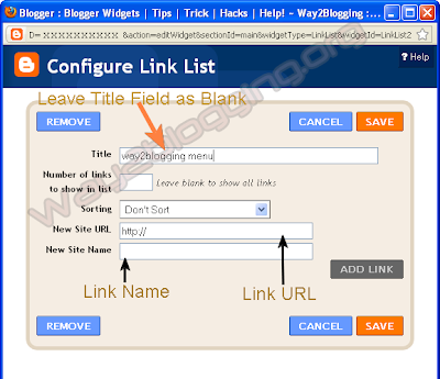
First Have A Look On Image Or See The Demo Above
 |
| Click On The Image To Zoom It |
Find </head> Tag And Copy-Past The Below Code Just After It.
HTML Code
<div id="menu">
<ul class="level1">
<li class="level1-li"><a class="level1-a" href="#url">Home</a></li>
<li class="level1-li"><a class="level1-a fly" href="#url">Contact Us<!--[if gte IE 7]><!--></a><!--<![endif]-->
<!--[if lte IE 6]><table><tr><td><![endif]-->
<ul class="level2">
<li><a href="#url">Email</a></li>
<li><a href="#url">Telephone</a></li>
<li><a href="#url">Online Form</a></li>
<li><a href="#url">Snail Mail Address</a></li>
</ul>
<!--[if lte IE 6]></td></tr></table></a><![endif]--></li>
<li class="level1-li"><a class="level1-a fly" href="#url">Resort<!--[if gte IE 7]><!--></a><!--<![endif]-->
<!--[if lte IE 6]><table><tr><td><![endif]-->
<ul class="level2">
<li><a href="#url">Ski Hire Facilities</a></li>
<li><a class="fly" href="#url">Main Ski Slopes<!--[if gte IE 7]><!--></a><!--<![endif]-->
<!--[if lte IE 6]><table><tr><td><![endif]-->
<ul class="level3">
<li><a href="#url">Beginners Slopes</a></li>
<li><a href="#url">Intermediate Slopes</a></li>
<li><a class="fly" href="#url">Advanced Skill Levels<!--[if gte IE 7]><!--></a><!--<![endif]-->
<!--[if lte IE 6]><table><tr><td><![endif]-->
<ul class="level4">
<li><a href="#url">Local</a></li>
<li><a href="#url">Nearby</a></li>
<li><a href="#url">With instructor</a></li>
<li><a href="#url">Snow boarding</a></li>
</ul>
<!--[if lte IE 6]></td></tr></table></a><![endif]--></li>
<li><a href="#url">Expert</a></li>
</ul>
<!--[if lte IE 6]></td></tr></table></a><![endif]--></li>
<li><a href="#url">Night Life</a></li>
<li><a class="fly" href="#url">Restaurants<!--[if gte IE 7]><!--></a><!--<![endif]-->
<!--[if lte IE 6]><table><tr><td><![endif]-->
<ul class="level3">
<li><a href="#url">Snow Hotel</a></li>
<li><a href="#url">The Snowman</a></li>
<li><a href="#url">Ice Cavern</a></li>
<li><a href="#url">Ski Inn</a></li>
</ul>
<!--[if lte IE 6]></td></tr></table></a><![endif]--></li>
<li><a class="fly" href="#url">Car Hire<!--[if gte IE 7]><!--></a><!--<![endif]-->
<!--[if lte IE 6]><table><tr><td><![endif]-->
<ul class="level3">
<li><a href="#url">From Airport</a></li>
<li><a href="#url">In Resort</a></li>
<li><a href="#url">Multiple Resorts</a></li>
</ul>
<!--[if lte IE 6]></td></tr></table></a><![endif]--></li>
</ul>
<!--[if lte IE 6]></td></tr></table></a><![endif]--></li>
<li class="level1-li"><a class="level1-a fly" href="#url">Surrounding Area<!--[if gte IE 7]><!--></a><!--<![endif]-->
<!--[if lte IE 6]><table><tr><td><![endif]-->
<ul class="level2">
<li><a href="#url">Where to go</a></li>
<li><a href="#url">What to do</a></li>
<li><a href="#url">Places of interest</a></li>
<li><a href="#url">National parks & Museums</a></li>
</ul>
<!--[if lte IE 6]></td></tr></table></a><![endif]--></li>
<li class="level1-li"><a class="level1-a" href="#url">Privacy</a></li>
<li class="level1-li"><a class="level1-a" href="#url">About Us</a></li>
<li class="level1-li"><a class="level1-a" href="#url">Contact Us</a></li>
<li class="level1-li"><a class="level1-a" href="#url">SiteMap</a></li>
<li class="level1-li"><a class="level1-a" href="#url">Official Website</a></li>
<li class="level1-li left"><a class="level1-a fly" href="#url">Information<!--[if gte IE 7]><!--></a><!--<![endif]-->
<!--[if lte IE 6]><table><tr><td><![endif]-->
<ul class="level2">
<li><a href="#url">Money Exchange</a></li>
<li><a class="fly" href="#url">Resort Essential Information<!--[if gte IE 7]><!--></a><!--<![endif]-->
<!--[if lte IE 6]><table><tr><td><![endif]-->
<ul class="level3">
<li><a href="#url">Lift Passes</a></li>
<li><a href="#url">Insurance</a></li>
<li><a class="fly" href="#url">Gear Rental<!--[if gte IE 7]><!--></a><!--<![endif]-->
<!--[if lte IE 6]><table><tr><td><![endif]-->
<ul class="level4">
<li><a href="#url">Boots</a></li>
<li><a href="#url">Skis</a></li>
<li><a href="#url">Ski Wear</a></li>
<li><a href="#url">Goggles</a></li>
</ul>
<!--[if lte IE 6]></td></tr></table></a><![endif]--></li>
<li><a href="#url">Ski Schools</a></li>
<li><a href="#url">Snow Report</a></li>
</ul>
<!--[if lte IE 6]></td></tr></table></a><![endif]--></li>
<li><a class="fly" href="#url">Language<!--[if gte IE 7]><!--></a><!--<![endif]-->
<!--[if lte IE 6]><table><tr><td><![endif]-->
<ul class="level3">
<li><a href="#url">Austrian</a></li>
<li><a href="#url">German</a></li>
<li><a href="#url">French</a></li>
<li><a href="#url">English</a></li>
</ul>
<!--[if lte IE 6]></td></tr></table></a><![endif]--></li>
<li><a href="#url">Short Breaks</a></li>
</ul>
<!--[if lte IE 6]></td></tr></table></a><![endif]--></li>
</ul>
</div>
<!-- Dropdown HTML Menu End -->
Than Again Find ]]></b:skin> And Copy-Paste The Below Code Just Above It.
CSS Code
#menu { background-color: #ba1eaa;
background-image: -moz-linear-gradient(#04acec, #ba1eaa);
background-image: -webkit-gradient(linear, left top, left bottom, from(#04acec), to(#ba1eaa));
background-image: -webkit-linear-gradient(#04acec, #ba1eaa);
background-image: -o-linear-gradient(#04acec, #ba1eaa);
background-image: -ms-linear-gradient(#04acec, #ba1eaa);
background-image: linear-gradient(#04acec, #0186ba);
height:35px;; text-align:center; position:fixed; z-index:20; right: 0%; left: 0%;}
#menu ul {display:inline-block;}
#menu li {margin:0; padding:0; list-style:none;}
#menu li {clear:both;float:none;}
#menu ul ul {position:absolute; left:-9999px;}
#menu ul.level1 {margin:0 auto;}
#menu ul.level1 li.level1-li {float:left; display:block; position:relative;clear:none;}
#menu ul.level1 {
background-color: #ba1eaa;
background-image: -moz-linear-gradient(#04acec, #ba1eaa);
background-image: -webkit-gradient(linear, left top, left bottom, from(#04acec), to(#ba1eaa));
background-image: -webkit-linear-gradient(#04acec, #ba1eaa);
background-image: -o-linear-gradient(#04acec, #ba1eaa);
background-image: -ms-linear-gradient(#04acec, #ba1eaa);
background-image: linear-gradient(#04acec, #0186ba)
}
#menu ul.level2 {
background-color: #ba1eaa;
background-image: -moz-linear-gradient(#04acec, #ba1eaa);
background-image: -webkit-gradient(linear, left top, left bottom, from(#04acec), to(#ba1eaa));
background-image: -webkit-linear-gradient(#04acec, #ba1eaa);
background-image: -o-linear-gradient(#04acec, #ba1eaa);
background-image: -ms-linear-gradient(#04acec, #ba1eaa);
background-image: linear-gradient(#04acec, #0186ba)
height:35px; width:250px;}
#menu ul.level3 {
background-color: #ba1eaa;
background-image: -moz-linear-gradient(#04acec, #ba1eaa);
background-image: -webkit-gradient(linear, left top, left bottom, from(#04acec), to(#ba1eaa));
background-image: -webkit-linear-gradient(#04acec, #ba1eaa);
background-image: -o-linear-gradient(#04acec, #ba1eaa);
background-image: -ms-linear-gradient(#04acec, #ba1eaa);
background-image: linear-gradient(#04acec, #0186ba)
height:35px; width:250px;}
#menu ul.level4 {
background-color: #ba1eaa;
background-image: -moz-linear-gradient(#04acec, #ba1eaa);
background-image: -webkit-gradient(linear, left top, left bottom, from(#04acec), to(#ba1eaa));
background-image: -webkit-linear-gradient(#04acec, #ba1eaa);
background-image: -o-linear-gradient(#04acec, #ba1eaa);
background-image: -ms-linear-gradient(#04acec, #ba1eaa);
background-image: linear-gradient(#04acec, #0186ba)
height:35px; width:250px;}
#menu b {position:absolute;} /* -- for IE6 non-flyout dropdowns to stop flickering - who knows why --*/
#menu a {display:block; font:normal 14px Arial; color:#fff; line-height:35px; text-decoration:none;padding:0px 15px 0 15px;outline:none;}
#menu ul.level1 li.level1-li a.level1-a {float:left;}
#menu ul li:hover > ul {visibility:visible; left:0; top:35px;}
#menu ul ul li:hover > ul {visibility:visible; left:100%; top:auto; margin-top:-35px;}
#menu li.left:hover > ul {visibility:visible; left:auto; right:0; top:25px;}
#menu li.left ul li:hover > ul {visibility:visible; left:auto; right:100%; top:auto; margin-top:-25px;}
#menu a:hover ul {left:0; top:30px;}
#menu li.left a:hover ul {left:auto; right:-1px; top:30px;}
#menu li.left ul a {text-align:right; padding:0 15px 0 15px;}
#menu a:hover a:hover ul,
#menu a:hover a:hover a:hover ul {left:100%; visibility:visible;}
#menu li.left a:hover a:hover ul,
#menu li.left a:hover a:hover a:hover ul {left:auto; right:0; visibility:visible;}
#menu a:hover ul ul,
#menu a:hover a:hover ul ul {left:-9999px;}
#menu li.left a:hover ul ul,
#menu li.left a:hover a:hover ul ul {left:-9999px;}
#menu li a.fly {font-variant: small-caps;}
#menu li.left ul a.fly {font-variant: small-caps;}
#menu li a:hover,
#menu li a.fly:hover {
background-color: #ba1eaa;
background-image: -moz-linear-gradient(#04acec, #ba1eaa);
background-image: -webkit-gradient(linear, left top, left bottom, from(#04acec), to(#ba1eaa));
background-image: -webkit-linear-gradient(#04acec, #ba1eaa);
background-image: -o-linear-gradient(#04acec, #ba1eaa);
background-image: -ms-linear-gradient(#04acec, #ba1eaa);
background-image: linear-gradient(#04acec, #0186ba)
}
#menu li:hover > a,
#menu ul li:hover > a.fly {
background-color: #ba1eaa;
background-image: -moz-linear-gradient(#04acec, #ba1eaa);
background-image: -webkit-gradient(linear, left top, left bottom, from(#04acec), to(#ba1eaa));
background-image: -webkit-linear-gradient(#04acec, #ba1eaa);
background-image: -o-linear-gradient(#04acec, #ba1eaa);
background-image: -ms-linear-gradient(#04acec, #ba1eaa);
background-image: linear-gradient(#04acec, #0186ba)
}
#menu table {position:absolute; height:0; width:0; left:0; border-collapse:collapse; margin-top:-4px;}
#menu table table {position:absolute; left:99%; height:0; width:0; border-collapse:collapse; margin-top:-29px;}
#menu li.left table {position:absolute; height:0; width:0; left:auto; right:0; border-collapse:collapse; margin-top:-4px;}
#menu li.left table table {position:absolute; left:auto; right:100%; height:0; width:0; border-collapse:collapse; margin-top:-29px;}
#menu ul, .tabs-outer {overflow:visible;}
#menu li a {border: none;}
.main-outer {z-index:10;}/*for IE*/
.tabs-outer {z-index:11;}/*for IE*/
Click Save Template And Enjoy.If You Have Any Error Please Contact Me.
Don't Forget To Say Thanks